
Redesigning Drata's Product Experience
A company-wide redesign of Drata's entire product, including a unified design system, that shipped to beta in twelve months.

ROLE
TOOLS
Figma, Storybook, GitHub, Augment (VS Code)
PROBLEM
Drata's product hadn't kept pace with its own growth: object relationships were hidden across the app, work surfaces couldn't flex to enterprise complexity, and accessibility and AI-readiness hadn't been built in from the start.
RESULTS
Redesigned the entire app, documented ~100 components, and shipped to opt-in beta in 12 months. In the 3 months following launch, responded to user feedback and lowered beta opt-out rates from 45% to under 18%.
Overview
Drata is a trust management platform used by thousands of teams to automate compliance across frameworks like SOC 2, ISO 27001, and GDPR. This redesign went beyond visual updates. It rebuilt the product's information architecture, interaction patterns, and front-end foundation from the ground up.
The result: enterprise customers could find value faster, navigate with more clarity, and shape the product around their own complexity instead of working around it.
Across every section, user feedback pointed to the same recurring needs:
Make object relationships visible. Objects across the product, like controls, tests, and personnel, needed visible connections so users could see how one piece affected the rest of their program.
Small next steps alongside full work surfaces. Guided actions gave users a deeper understanding of their governance, risk, and compliance (GRC) posture and sharper focus on what needed to be done.
Flexibility for enterprise complexity. Users needed the flexibility to shape the product around their own workflows.
Accessibility as a requirement, not an add-on. A flow only counted as finished if every teammate could use it.
Built to support what's next in AI. AI needed to be a part of daily work, and modular, consistent patterns gave the product a foundation to support AI features as they arrived.
The stakes were real. New customers struggled to onboard amid inconsistent patterns. Some of our most experienced users were falling out of love with an interface that hadn't kept up with their growing needs, which was a real driver of churn. Our drawer and table patterns also couldn't flex to the needs of mid-market and enterprise customers as their programs scaled.

Role
I was one of five designers responsible for both evolving Drata's design system and applying it across the application.
Specifically, I:
Led the redesign of six app sections: Personnel, User Access Review, Events, Monitoring, Assets, and Policies
Re-evaluated information architecture and user flows in each section, alongside visual and component-level cohesion
Designed new components where gaps existed, working with PMs and engineers to validate, build, and keep them aligned across sections
Documented ~100 Storybook components, using Augment in VS Code to reference the codebase directly
Served as the main point of contact for my engineering pod during UAT and handoff, running refinement sessions and clearing blockers
Recognized by the PM on my team for proactively resolving blockers and maintaining cross-functional alignment under pressure
Process
1. Start with the ideal, then scale back
I designed each section without constraints first, imagining the ideal experience before technical realities shaped it. From there, I partnered with PMs and engineers to define what was achievable near-term, making deliberate tradeoffs rather than defaulting to the easiest path.
2. Ground decisions in user feedback
Every decision traced back to what we heard directly from users, not assumptions about what the product needed. Those insights, the same ones outlined above, anchored the redesign and gave the team confidence in the structural bets being made.
3. Collaborate, stay consistent
Staying consistent meant close collaboration with the other four designers throughout the project, cross-checking components, flagging duplication, and only introducing new ones when truly needed. This constant back-and-forth is what kept the design system feeling like one coherent product instead of six separately designed sections.
4. Test, learn, iterate
Opt-in beta gave the team a direct line to how the product was actually being used, and where it wasn't working. We treated the first few months after launch as an active feedback loop rather than a finish line, revisiting decisions and shipping fixes based on what we were seeing.
Solution
The redesign answered each of these needs with a structural solution, not just a surface fix.
Make object relationships visible → context previews and explicit object mapping. Detail pages now showed related objects directly, and context previews let users open any linked object inline without leaving the page.
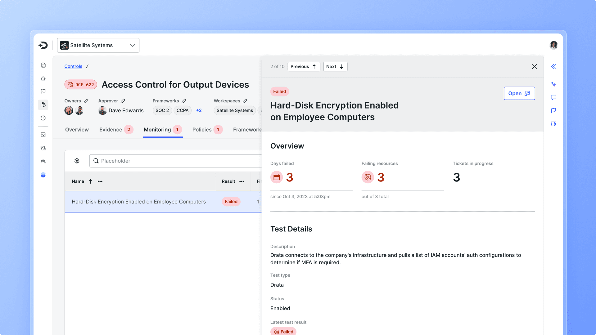
Small next steps alongside full work surfaces → Full-screen detail pages, a utility bar, and an action panel.
Full-screen detail pages, organized by tabs instead of confusing drawers, gave deep work real space.
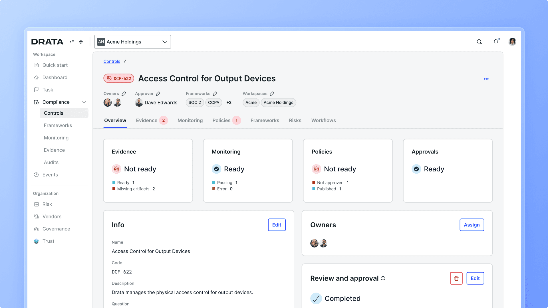
A utility bar brought tickets, tasks, conversations, and agentic experiences into every page, so users could collaborate without losing context.
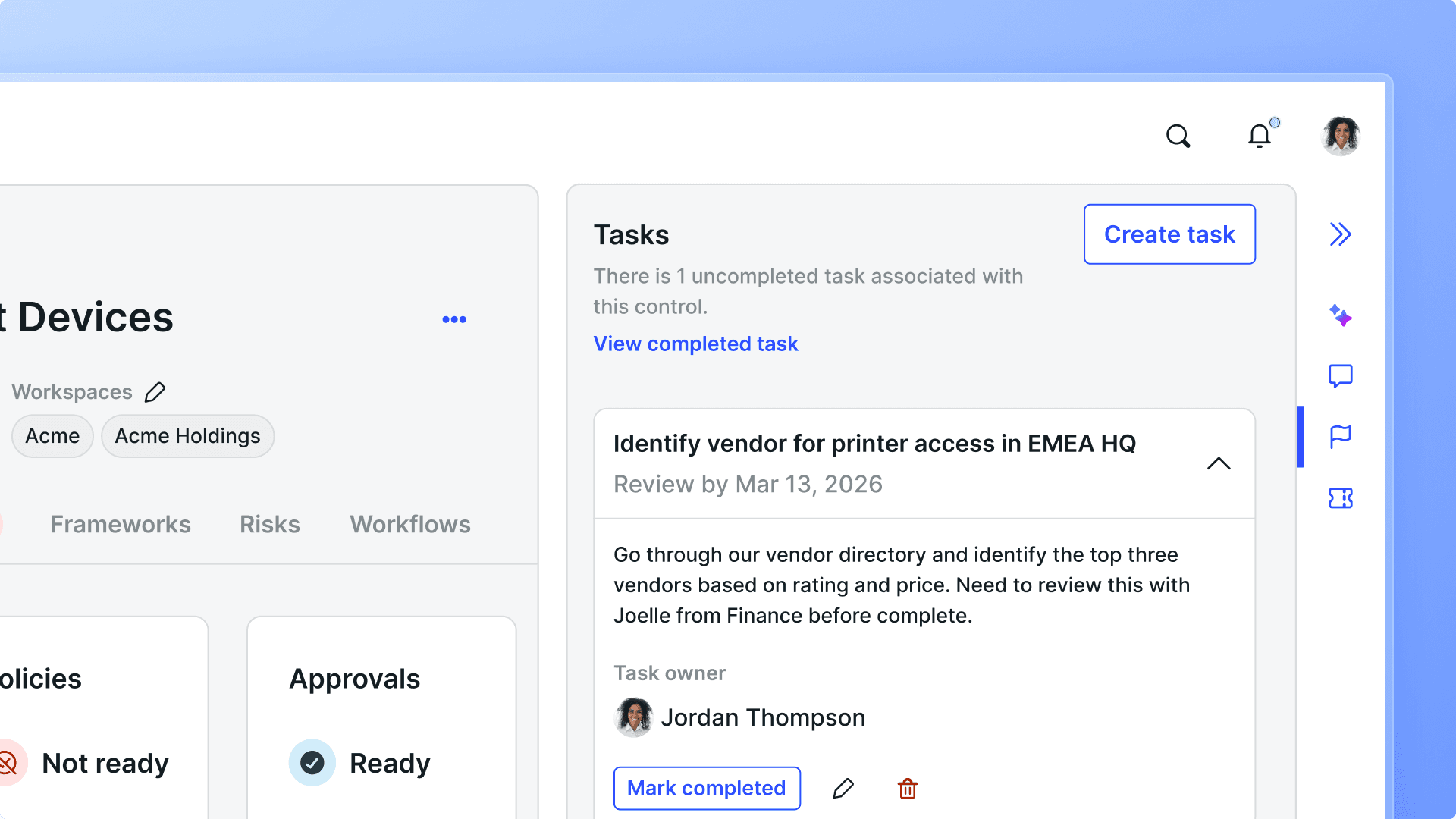
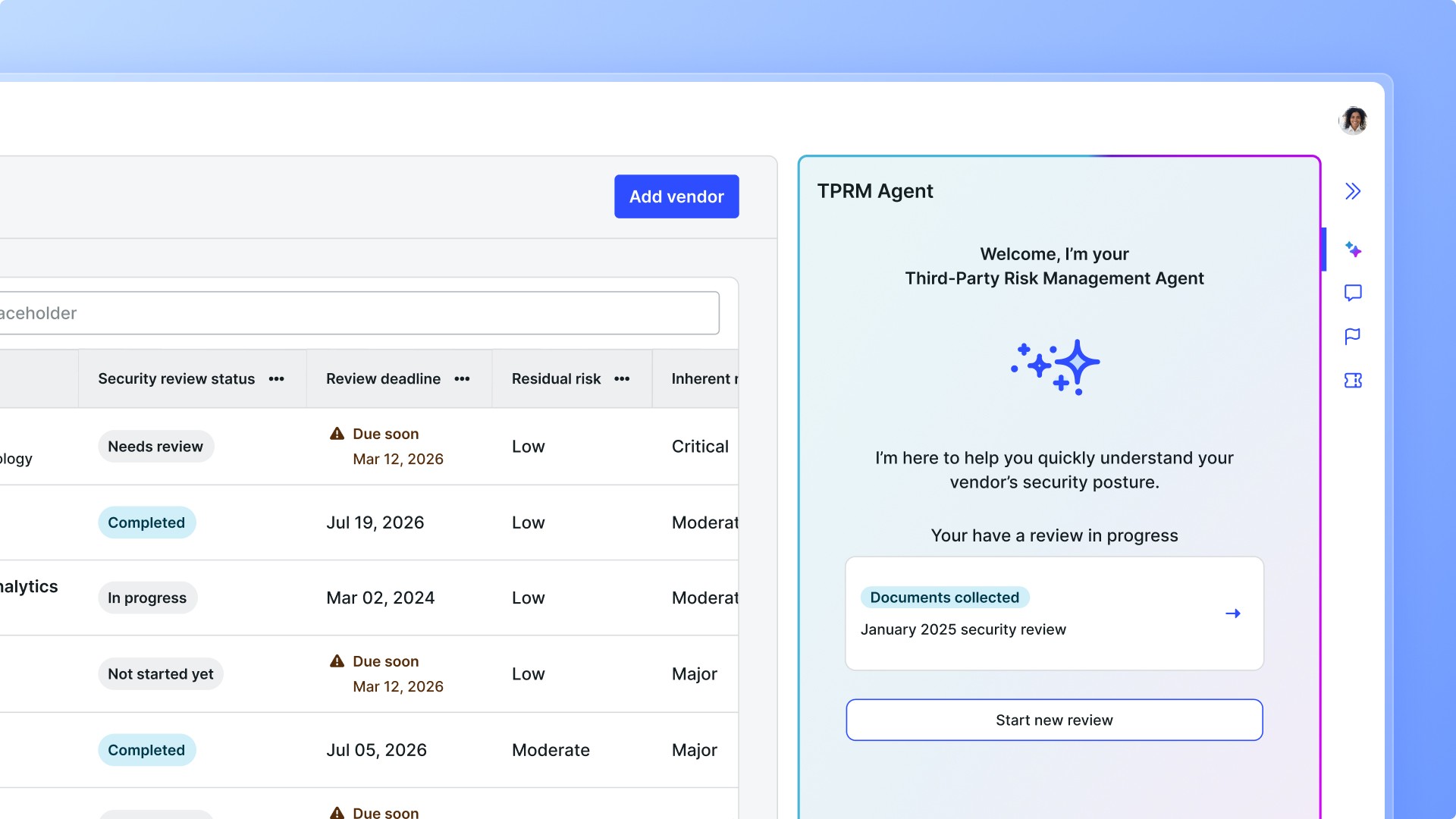
An action panel acted as an AI-powered command center, surfacing next-best actions and guiding users through them.
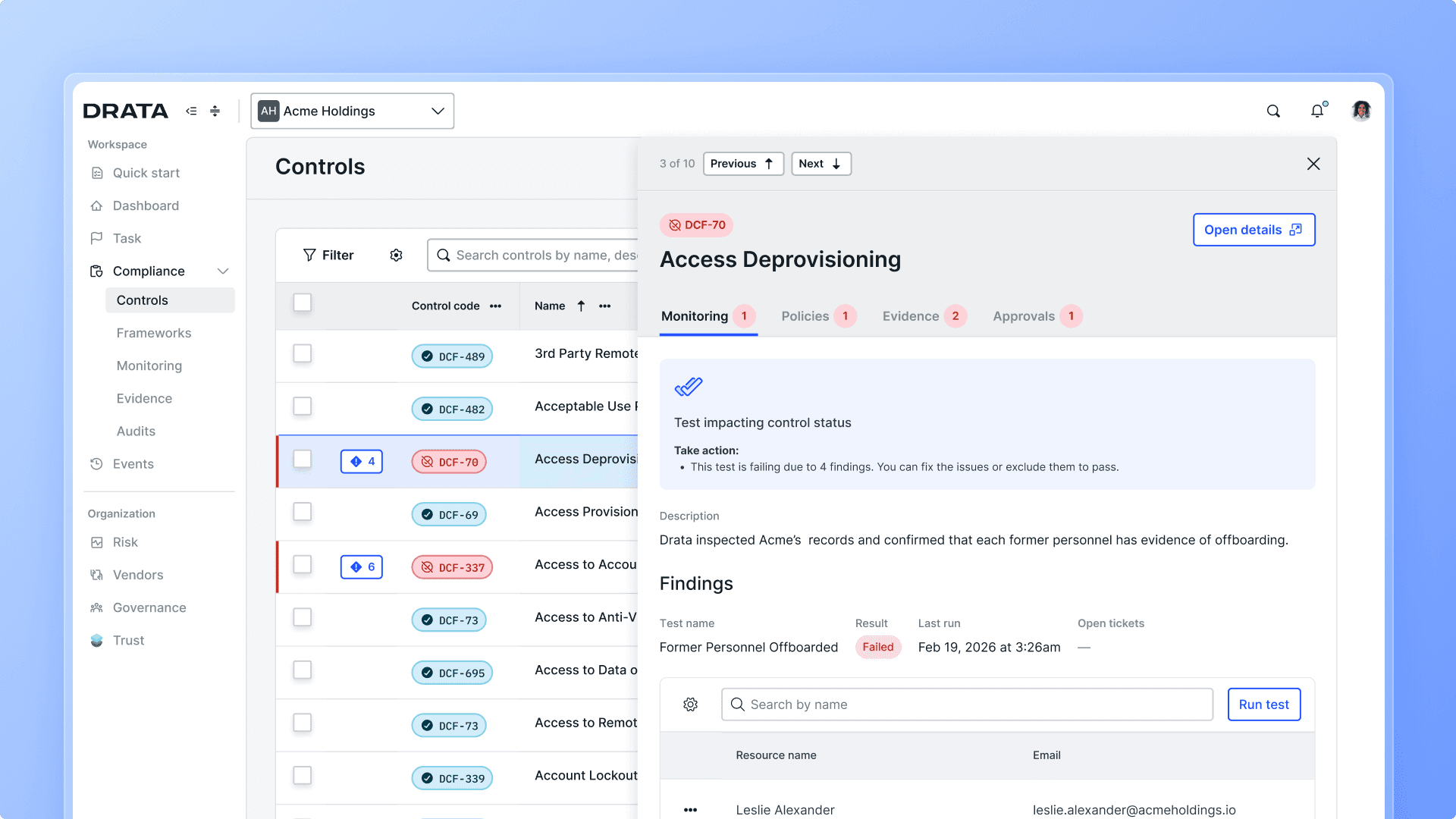
Flexibility for enterprise complexity → Configurable tables. Power users could now adjust column order and custom fields directly in Drata, without relying on external tools to get the view they needed.

Design and engineering misalignment → Storybook documentation. Documenting ~100 components gave designers and engineers a shared, agreed-upon foundation to build from, cutting down on QA challenges that had been delaying releases and forcing scope cuts.
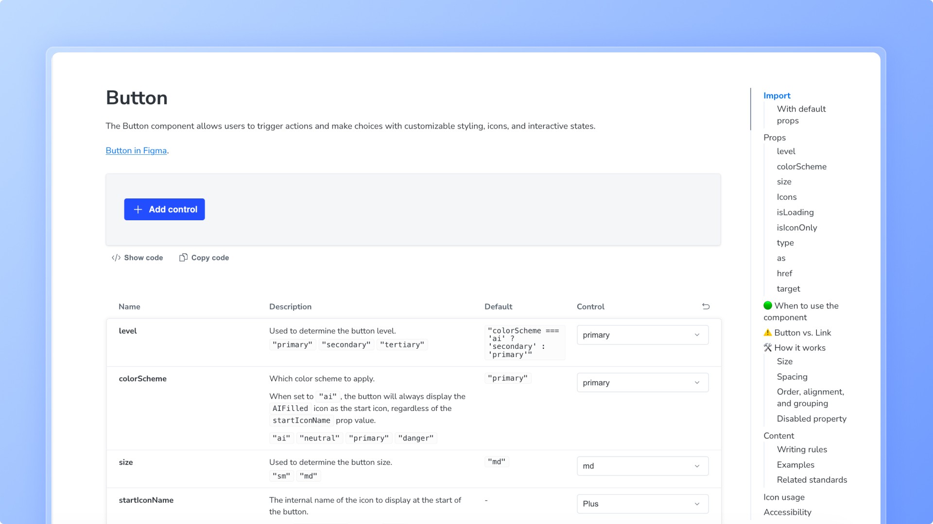
A foundation built for what’s next in AI → Built on everything above. Visible object relationships, full-screen work surfaces, and inline context laid the groundwork AI features would need.
Accessibility as a requirement → Built-in accessibility standards. Keyboard navigation, screen reader support, and color perception were built into every component I worked on, ahead of the company’s broader move toward WCAG compliance in 2026.
And finally: dark mode, a feature users had been asking for a long time, shipped across the application.

Outcome
Contributed to the largest structural redesign in Drata's history. The full effort, engineering builds, UAT, and company-wide rollout, took twelve months and required tight alignment across design, engineering, and product.
Gave design and engineering a shared source of truth for the first time, directly reducing the QA-driven delays and scope cuts that had been slowing releases
In the three months following beta launch, we lowered beta opt-out rates from 45% to under 18%, in direct response to user feedback gathered during the beta
Gave the team a foundation to start prototyping directly with our actual components in Claude Code, enabling faster, more realistic prototypes instead of starting from scratch each time
The result wasn't a single release. It was infrastructure the product could keep building on going forward, including the AI-powered features that came after.
Reflections
This project was originally scoped for three months. It ultimately took twelve, a reminder that early timeline estimates are often just starting guesses. The real scope of a project this size only becomes clear once you're deep into the work. What made that stretch possible wasn't just design decisions, it was communication. Staying aligned with a large, cross-functional team while working remotely meant being deliberate: surfacing blockers early, over-communicating decisions rather than assuming they'd land, and making sure nothing got lost between time zones and async updates. This was one of the most demanding projects I've ever worked on, and I'm grateful I got to do it alongside an amazing team.


