Designing Drata's Notifications Platform
A ground-up strategy for Drata's fragmented notifications system, from a full product audit through research synthesis, to a validated prototype and hi-fi design.

ROLE
TOOLS
Figma, FigJam, v0, Gong
PROBLEM
Notifications at Drata had never been standardized. Each app section's notifications were built independently by a different team, with no shared system tying them together. As Drata grew, that left enterprise customers without the control they needed and users buried in noise they couldn't act on.
RESULTS
The first full audit of Drata's notification system, a prototype validated with real customers, and a prioritized roadmap slice taken through to hi-fi design.
Overview
Drata is a security and compliance automation platform, and compliance work means keeping people on top of a constant stream of deadlines: policies to renew, controls to approve, tasks to complete. Notifications are the product's main way of doing that, telling people what needs their attention and when. At Drata, though, that channel had never been built as one system. Each app section's notifications were built independently by a different team, with no shared system tying any of it together.
That absence of a shared system created two distinct problems as Drata scaled. Enterprise customers needed real control and flexibility they didn't have, since no admin could see or manage what was being sent across sections. Users on the receiving end got hit with overlapping, redundant alerts from systems that had never talked to each other, so even the ones that actually mattered got lost in the noise.
There wasn't a single broken screen to fix here. The goal wasn't to patch any one notification type, it was to build one coordinated system that gave admins real visibility and control, and gave users a clear signal of what actually needed their attention.
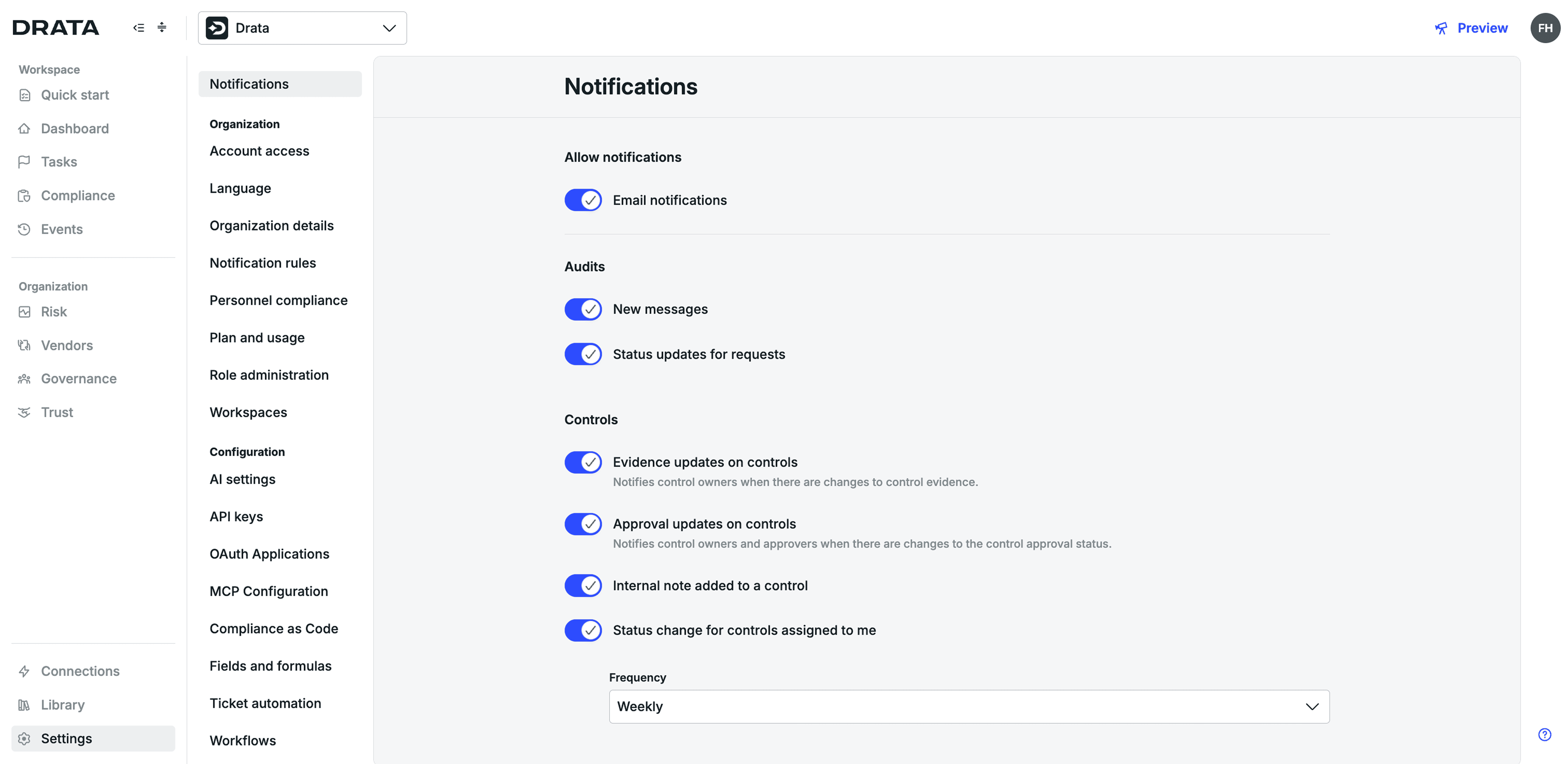
The original Notifications page in Drata. This was the only place users could control which notifications they received.
Role
I owned this project end to end. I:
Ran Drata's first full audit of every notification in the product, working with each app section's team to compile it
Pulled together pain points reported by customer success managers (CSMs) and a competitor analysis to ground the initial direction
Facilitated a rose-bud-thorn workshop and synthesized findings into an OST and a swim-lane journey map
Built a v0 prototype and ran 11 customer research calls to validate it directly with admins and users
Prioritized and sliced the vision, then took the top-priority slice through to hi-fi design
Process
1. Auditing what already existed
No one had ever mapped every notification sent across Drata in one place, so I started there. That meant going section by section, working with each team to pull together what existed. It gave the team one complete view of how fragmented the system actually was, instead of each team only knowing their own corner of it.
2. Gathering customer and market evidence
I synthesized a wide range of customer pain points and feature requests surfaced through CSM calls, and conducted a competitor analysis to see how other platforms handled similar problems. Together, that grounded the direction in actual customer signal, rather than internal assumptions about what admins and users needed.
3. Turning research into a shared framework
I ran a rose-bud-thorn workshop internally with stakeholders to gather additional insights beyond the audit and CSM data. From there, I synthesized all of it into an OST and a swim-lane journey map, creating a shared understanding of the problem space the whole team could align around before jumping to solutions.
4. Prototyping and validating
I built a v0 prototype to show what an ideal notification experience could look like for both admins and users. I validated it through 11 customer research calls and an internal Product Review with product and design leadership, then iterated on the design based on the feedback from both.
5. Prioritizing and moving to hi-fi design
Notifications was too large to build all at once, so I worked with the team to prioritize realistically, sliced the vision into workable pieces, and took the top slice through to hi-fi design.
Solution
This direction addressed each of these problems as part of one coordinated system:
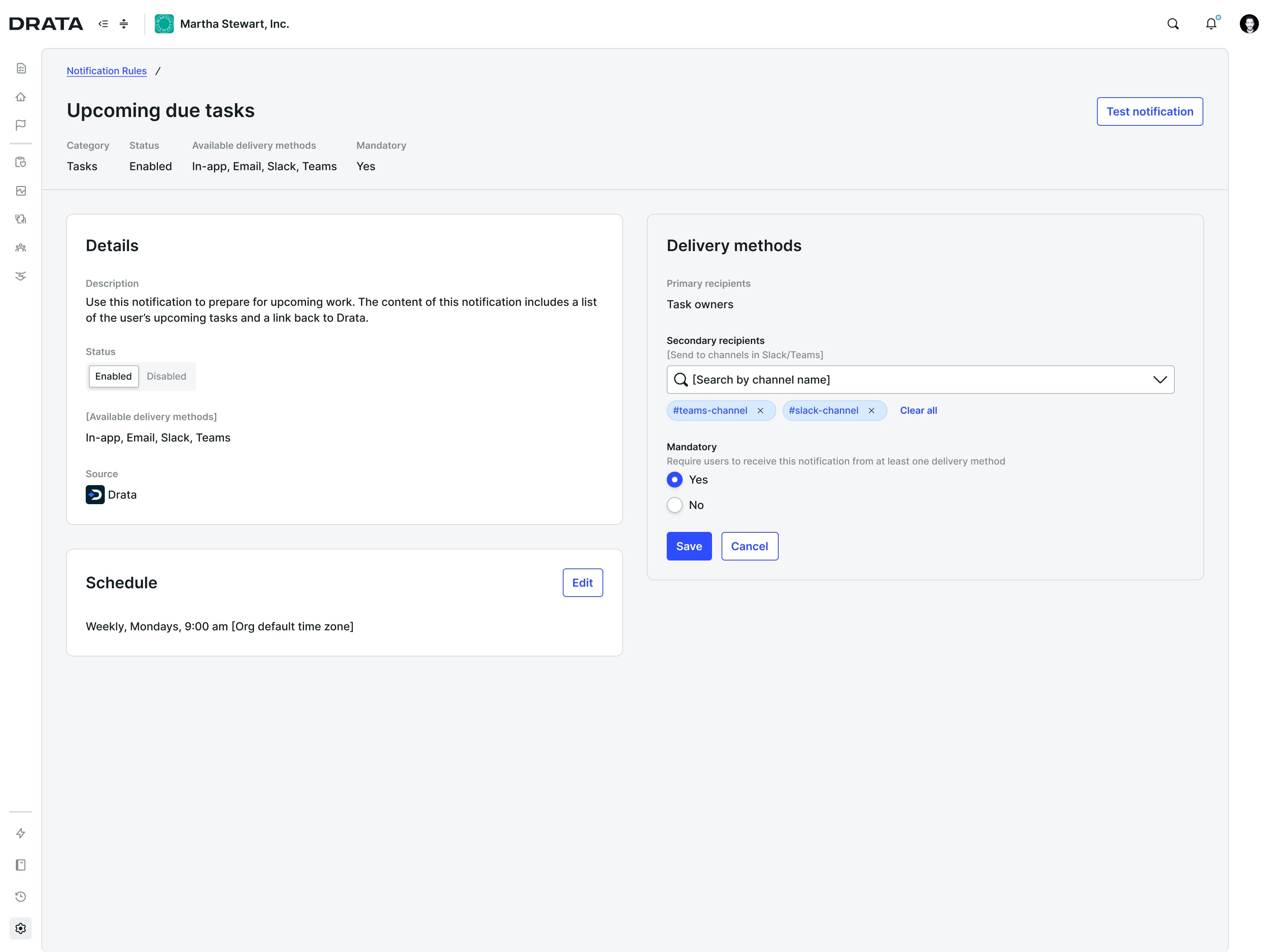
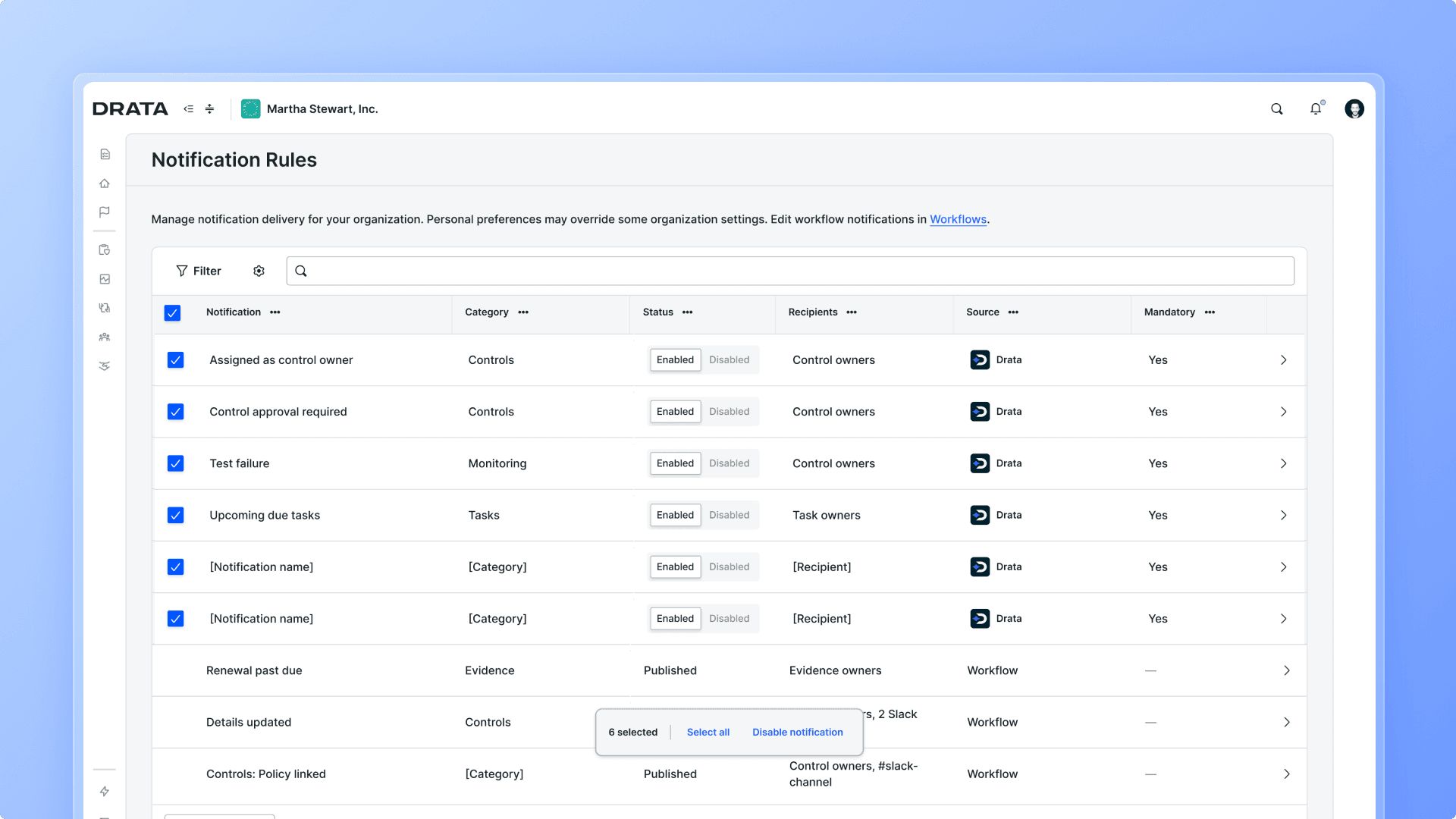
No single view for admins → a Notification Center. Notifications were a black box: no way to see what was being sent, to whom, or why. Now there's one place to see and manage all of it.
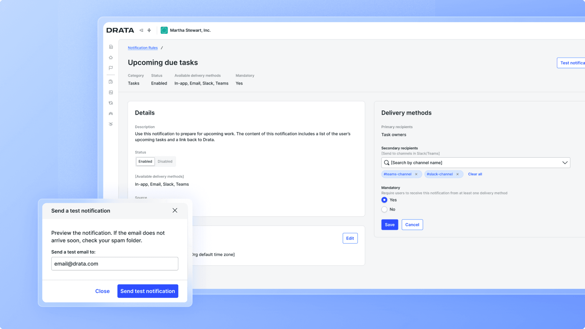
No way to configure notifications → full rule customization. Every org got the same rigid, one-size-fits-all setup. Now admins could tailor any rule to fit how their org actually worked, with preview and test-send before anything went live.
No inbox for users → a Notification Hub. With notifications scattered across channels and no feed to look back through, users often missed things they owned. The hub gave everyone one place to see it all.
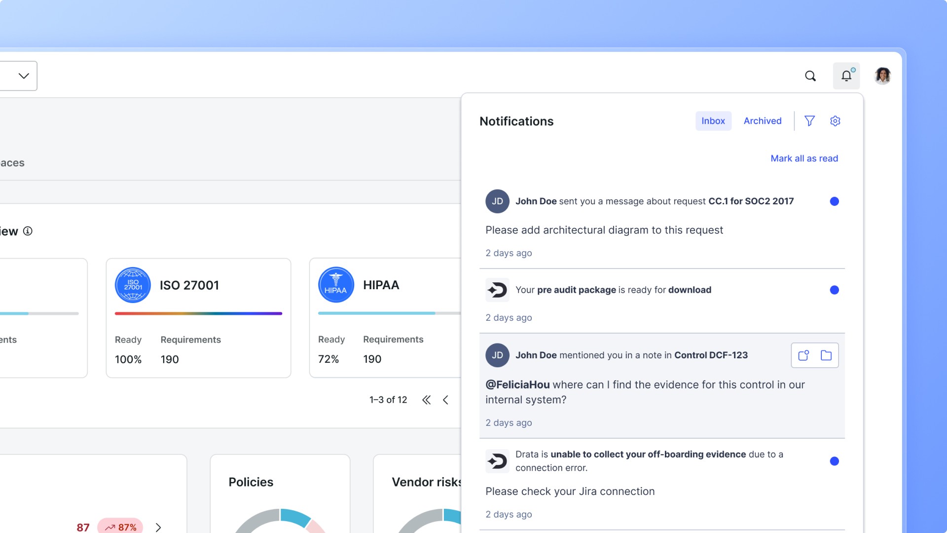
Notification fatigue → real customization for users. Users could set their preferred channel, digest frequency, and timezone, and turn off anything admins had marked optional. Instead of drowning in noise, they could finally see what actually mattered.

Outcome
This work delivered:
A validated vision for a centralized Notification Center that gave admins real visibility and control, and gave users a clear signal of what needed their attention
The first complete map of Drata's notification landscape, surfacing a problem that had grown quietly across every app section for years
Recognized by my manager for setting a new standard for "Product Review-ready" work, balancing near-term roadmap needs with a longer-term, customer-centric vision
The result wasn't a single deliverable. It was a validated direction, proven with real customers and internal stakeholders, that the team could act on whenever priorities allowed it.
Reflections
This was the most open-ended project I worked on at Drata: no existing screen to redesign, no clear brief, just a problem that touched almost everything.
The biggest lesson was about fidelity. My early prototypes looked polished by default, since v0's AI generation defaults to a finished look, and it backfired: stakeholders reacted to the finish instead of the flow. Once I started deliberately designing them to look more like wireframes, the feedback I got became far more useful.
What stayed with me most was the coordination this took. Pulling every team that had built notifications in isolation into one shared picture, then designing something that actually served admins and users at the same time instead of favoring one, is what made the eventual direction hold together. That's the kind of groundwork I'd bring to any project this broad again.